|
Introduction Carnegie Mellon University’s TRACES Lab (HCII/SOA) is exploring how to use emerging technologies to help spatially and temporally scaffold documentation practices in creative, constructive project-based learning experiences. Through a co-design process with Quaker Valley High School educators and administration, the project team has generated multiple proposals for connected technologies solutions to support documentation practices for their sophomore year Self Directed Learning (SDL) project experiences.
In the first quarter of 2021, we developed a browser-based system for Quaker Valley students to submit their SDL evidence and view their progress. This post provides an overview of the technical implementation and details some of the decision points, challenges, and potential improvements. Quaker Valley schools bases at least part of their IT infrastructure on the Google Workspace suite of tools. Thus, in the interest of development time/cost and integration with existing systems employed at Quaker Valley, we tried to leverage existing Google tools/services when when making technology decisions.
0 Comments
by Ricky Chen This summer, I joined Marti Louw and Daragh Byrne for the NSF funded summer Research Experience for Undergraduate (REU) program in the Human-Computer Interaction Institute (HCII) at Carnegie Mellon to better understand and explore how research is conducted in the fields of learning science and design. Previously, I was working with them during the Spring semester on prototyping the physical booth space and digital interfaces for Quaker Valley’s self-directed learning initiative. While I worked on this a bit during the summer, my main learning outcomes are from learning to conduct more formal user research in the format of design probes as well as qualitative data analysis.
Documentation is a critical part of the making process. It allows us to share our work, learn from our mistakes, and teach others. So why is it often undervalued or neglected? Simply put, good documentation is difficult. It requires additional time and effort, but more importantly, it requires us to stop making and redirect our attention every time something interesting happens.
This can be especially difficult when it comes to making physical objects, where images and video are crucial to making documentation comprehensible. However, standard setups require keeping track of camera battery and memory levels, and taking the time to charge, set up, and take down rigs. This work is followed either by one long video or several shots which are tedious to edit, and make it difficult to pick out key moments. My goal for this project is to design, build, and test a device which allows makers to capture and organize video without taking them away from their work, and to ease the post-processing work of converting raw footage to a usable end product. To meet this goal, my project is centered around a camera device which is meant to sit on a workbench in a classroom. It includes a camera, buttons, RFID reader, and a raspberry pi, among other components. As shown in the primary use case scenario, the only setup required of the user is to place their ID card on the device, press the record button, and hit other large buttons if there is a moment they deem important enough to mark. The flexible neck of the device allows it to be moved around easily and placed in the right position. The rest is taken care of behind the scenes. The flowchart below includes an initial concept for the code structure which will run on the raspberry pi. Once a user places their card on the reader, all video which they capture will be automatically organized, edited, and saved to a folder in their google drive account. If they prefer more control over the video, they can easily access videos which have been cut, sorted, and renamed in an organized fashion based on the times they marked moments as important. Rather than searching through hours of video, they should be able to manage their library more easily, without the difficulties of limited camera storage and transferring files. However, the device also takes this a step farther by generating its own video edit. Based on the user’s button presses, the algorithm can approximate the most important time periods in the user’s process. It then speeds up the less important portions while leaving the important parts to play at their normal speed. This condenses the build session into a single short video which shows the user’s entire process while highlighting key moments, but does not require them to spend any time editing. I hypothesize that removing the barrier to entry which editing creates will encourage makers to create and share video documentation of their projects who otherwise would not. This device also has the potential to aid asynchronous online maker education. Instructors need finer control over their video edits to add audio, and enhance their explanations overall. This doesn’t lend itself well to the algorithmically generated edits, but would most likely benefit from the other automatic features of the device. The automatic uploads remove memory management concerns, and the automatic organization simplifies the editing process, as shown in the secondary use case scenario. Because this project is meant to be accessible to instructors and makers working at home due to COVID-19, it is built entirely out of parts that are easy to order online, or can be adapted to the materials at hand. All plans, code, and documentation necessary to recreate the device will be open-source so that people can make it at home, and so that the maker community can improve on the design. In that same spirit, the device is designed to allow for additional inputs, so that it can record and edit based off of devices similar to those proposed by Patricia Yu, Miranda Luong, and Elizabeth Han. Natalia Zeller MacLean is a summer intern at the HCII and a rising senior (Class of 2021) in Mechanical Engineering at Cornell University. She serves as a mechanical and systems engineering team lead on Cornell Cup robotics, developing both modular educational robotic kits and a larger autonomous robot which explore human interaction with independent mobile robotics. In her free time, she fences epee on the varsity team, reads classical texts in latin, and tinkers with any broken mechanisms or electronics she can find. As a summer 2020 REU fellow, Natalia is prototyping a smart documentation automated timelapse tool to support at home documentation practices.  This Spring, the NSF Smart Tools project team hired two students, Eric Gan and Ricky Chen, to work on building concepts for a functional pitch booth. Ricky Chen was tasked with developing a Pitch Booth concept into a fully realized physical prototype to be tested with teachers and students at Quaker Valley High School, and evaluated against a set of success criteria. In tandem, Eric Gan was tasked with designing and implementing a raspberry pi based video reflection system for use in the pitch booth that would be deployed at Quaker Valley.
Installation of the pitch booth at Quaker Valley High School was scheduled for mid-March 2020. Through weekly iterative design with the research team, Eric and Ricky had each developed working parts of their respective pieces of the booth. Ricky’s pitch booth concepts evolved from sketches and models to a full-sized physical prototype built from foam core and adhesive. Up to this point, Eric had developed a walk-through version of the video recording interaction, including a landing screen, 3-digit participant sign in, and a management system for uploading completed videos to a secure server. When the stay at home order was announced due to Covid-19, the pitch booth installation at Quaker Valley High School was cancelled and the team had to pivot to create remote solutions. In partnership with Amy Keller and Linda Conlon from Quaker Valley, Ricky created design mockups for the outside of the booth that included Carnegie Mellon University’s logo, the NSF logo, and written information on the research study. Eric’s pivot included adding functionality to support pitch booth prompts, the ability to tag pitch videos with microcredentials, and recording time sequences. At the end of the semester, Amy and Linda reviewed student work via zoom. Ricky and Eric documented each part of their work and presented an example interaction of how a student would use the pitch booth from start to finish. 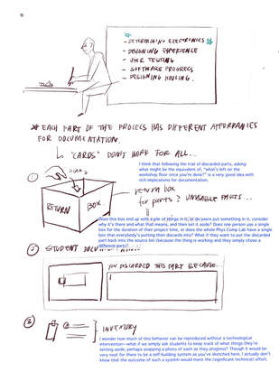 Ideation
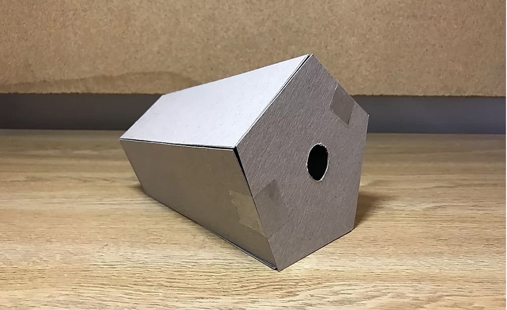
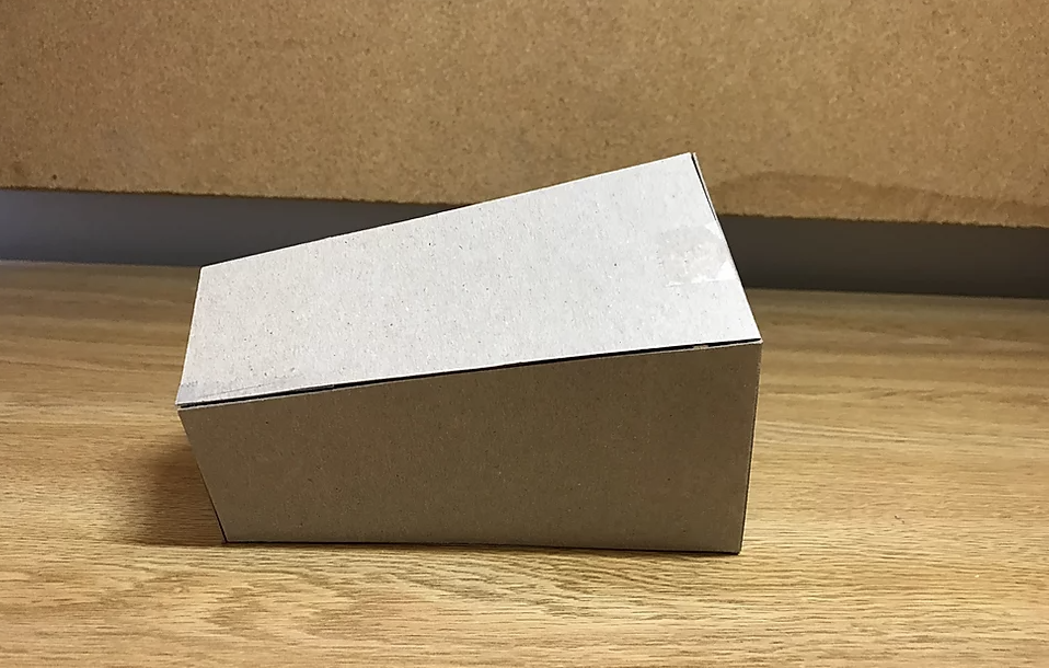
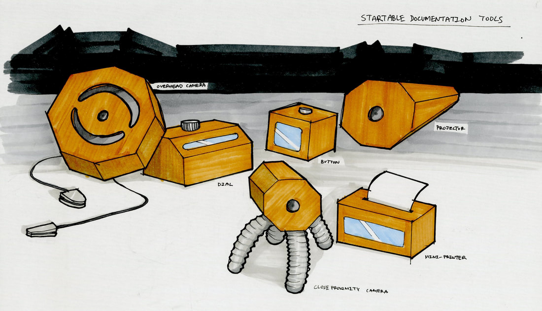
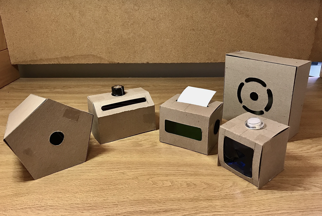
Elizabeth: Physicalizing documentation triggers I was initially focused on developing a documentation camera after Zach noted that it would be easy to develop from scratch. However, after consulting with Marti and Daragh, I realized more and more that I was falling into a rut. There were a few novel features, including automatic photo uploads to the student gallery and easy, student-based photo categorization. However, the resulting benefits seemed peripheral at best, as our initial interviews revealed that students had less trouble with documentation, but more trouble with learning about physical computing in the first place. As a result, I revisited the core student needs from the early storyboards: how might we improve student learning in physical computing? From this, I came to one key realization that I previously failed to consider: a singular documentation practice is unsuitable for all processes in a physical computing project. For instance, while the beginning of a project might require more pen and paper for ideation sketching, the middle might require a more digital notation, as students typically work directly on the Arduino editor. As such, a documentation camera is not the most flexible solution given the changing nature of a physical computing environment. by Patricia Yu Overview I helped to develop ideas for and prototype a set of documentation tools to better integrate technology, space, and education. These tools will connect students with their creative processes to strengthen and deepen learning. This was part of a research project to help us develop a hypotheses for how documentation as a mediating process productively supports learning. These tools were created for the teaching program, Startable in Pittsburgh. Smart Tools: Bringing concepts together The Hub Projector The Hub Projector allows the tools that are being used personally to be integrated into a public space. The Hub Projector is able to connect to all of the other devices and project each individual device's functions onto a screen for everyone to observe. The form of the projector takes a complementary shape as the camera tools in this series. The back of the projector is smaller to the front face in order to establish the tilt of the body to be able to project an image onto a wall. This is valuable to students where documentation does not only become a process that is solely for themselves, but also something that can be publicized and shared with others. The projector acts as a platform that allows students to use these tools as part of their documentation, in presentations, and as a way of language to communicate their ideas to others. Final Product Reflections and Future Steps Overall, I really enjoyed this research experience, especially discussing these tools and ideas with other students and experts. Next semester I hope to follow on these 3 major areas: 1) I would like to further expand on interaction amongst all the the tools and how they can connect to the Hub Projector. For example, how exactly should a user navigate the digital interface when transferring data amongst the tools, and how do the different functionalities the tools when "collaborating" with each other emerge. To do this, I will be creating mockups for the UI/UX of these tools on an app. 2) I want to also experiment how I could completely eliminate the presence of personal phones in the context of these tools to allow a complete immersion of a "work space". This was a concept discussed with the teachers at Startable and the idea of creating almost a new "language" with just these documentation tools was agreed to be a very interesting and unique path for this project. There may also be an external device that students can wear that replaces the function of the phone, so when students enter a physical computing room, they place their phones in a stowaway area and replace them with a tool that will allow them to focus on their work. This could make the physical computing room seem like walking into a complete different space from the rest of the campus space and give students a new experience. 3) With working prototypes, I would want to do more user testing research to help me determine what other tools students may want and need in their making processes. Talking with experts of the physical computing lab would also help gather insightful information that would make these tools more valuable to student usage. 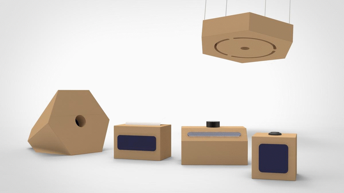 What the tools might look like when in use. by Ricky Chen I https://medium.com/@rckychen In the previous Smart Maker post, I documented my process of constructing the form of the booth while noting specific components like materiality, structure, and assembly. In this post, I will document the progress I have made on the video prompt interface, the visual components of the booth, and the video viewer interface for both the students’ side as well as for the teachers. Video Prompt Interface:My role in the video prompt interface was to refine and clean up the existing UI and prompts that the teachers and Eric Gan have settled on. After listening to the recorded QV 2/19/20 meeting, these were some of the key components on the video prompt interface that I noticed kept reoccurring in the meeting:
From this, I settled on SDL Studio to be the name of this space, which I feel is much more interesting than a booth or project. As for some of the wording, I refined everything to leave out the idea of this being a project so that it is more of an SDL experience for the students. In the interface, some visual elements that I refined were the typography, spacing, and background color. (insert photo) For the background, I decided to use a dark gray instead of a complete black to give a softer experience for the viewers’ eyes. A light yellow color is also used as the selection and highlight colors, which is based on the Quaker Valley gold color. However, the color on the screen is not the exact shade as the QV gold, so it might change in the future. The instructions at the bottom were also tightened up with it always being held by two brackets with the main verbs being in all caps for emphasis. By following this system, I was able to make the entire booth much more professional and cohesive through the uniformed style on each screen. One of the concerns of the teachers was on the screens that would show that that they were recording, and how we could make it less time-based to allow the students to focus more on their ideas rather than the time left. We thought of some ideas like a recording camera indicator to show that recording was in progress as well as a countdown timer to help give time, but in the end, we felt these were too intrusive for the experience that we want the students to have. After exploring a little more, we settled on a growing progress bar, which indicates that recording is happening as well as gives a softer approach to the time they have left compared to a countdown timer. (insert photo) The micro-credentials screen was one that had a lot of refinements. Originally, it would only show one micro-credential at a time, and the student would have to constantly scroll to go through each of them. I felt this was an issue as the students would not be able to see all their possible options at the same time. For this, I have changed it to where it shows all the possible micro-credentials on one screen, which I think would be helpful for when the students are deciding which one(s) they believe their evidence supports. It also has a done option, which only becomes available after a student has picked at least one option. Overall, the video prompt interface that Eric coded is quite similar to the ideal one that we have mocked up on the Google slides. They all have the necessary information on each screen, but there are some differences in type size, alignment, and content organization. In the future, I’m hoping that the actual program can become as close to the ideal version as possible so that we can have a more cohesive and uniformed interface. From this, we believe it will allow the students to have more professional experiences when using the SDL Studio, which will contribute to the overall learning goals we have for this space that we are creating. 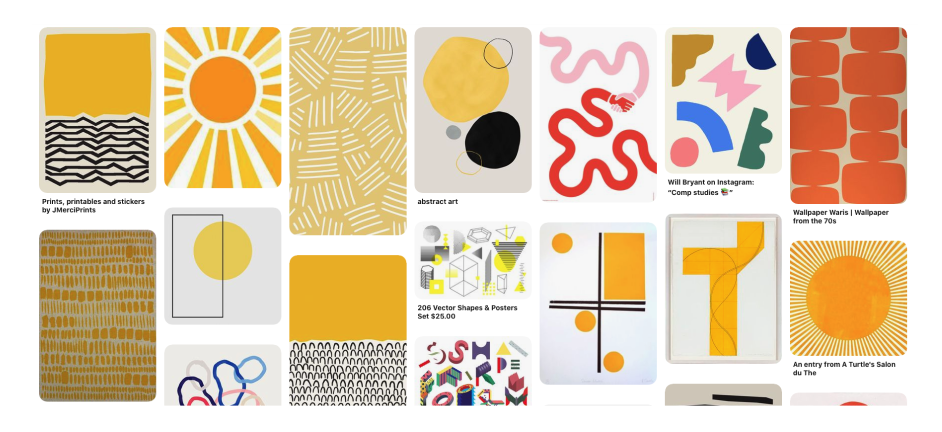 Booth Visual System: For the visual system of the booth, there were many different components to incorporate. After listening to the QV meeting audios, here are some components that I noted down:
From looking at some of their requirements, I started looking at some concept boards based on geometric shapes as well as QV colors. Much of foundational learning comes from the understanding of shapes, so I wanted to see how I could incorporate these simple elements to become components that would attract and incentivize the students to use the booth. (insert photo) In the end, this was the booth design that I came up with. It uses many simple geometric shapes as well as some intricate ones to emphasize certain words like fostering and new on the booth. From the final presentation, the teachers were pretty happy with this design, but I feel that there can still be some future iterations to help clean and simplify the design. On the right, it has the visual system with the colors, logos, and typeface that I used. I hope to keep refining this visual system as I continue to make progress in the design. In the end, these elements are also going to be incorporated in the storyboard and instructions I will be creating in the future to allow everything to be as cohesive as possible. During the final presentation, I also received interesting feedback about whether we have done testing to see whether the students would actually be attracted to the booth design that I have created. Initially, our plan was to do some testing and evaluation during the booth implementation phase, but due to the current situation, everything went remote, and I completely forgot about the importance of user testing. I am glad this feedback came up as it is very important to actually get some feedback from my main users. In the future when it becomes more possible, I think it would be a good effort to do some quick surveys and interviews with the students to get some insight into what they currently think about the visual designs I have created for their SDL experience, and how it can be improved to fit more of their interests and needs. Video Viewer Interface: (insert photo) For the video viewer interface, I initially started it off by making it as similar to the video prompt interface as possible. So here, it has the same 3-digit login screen as well as a similar type, color, and layout. For the first two columns, it shows the student’s side, and on columns three to six, it shows the teacher's side. I think overall, the student side was pretty easy to design as there are not as many components and functionality to include. The only important components are to show the different encounters as well as the evidence and micro-credential tags for the videos. The teacher's side was much harder as there are so many possible layers of information to showcase. Here, I decided to separate information based on students, calendar, encounters, and evidence and micro-credentials. After finishing this quite prototype, I realized the different components all shared similar information, and it was quite repetitive to have them all on different screens. Furthermore, from my first iteration, I got some feedback to actually look at some teacher dashboard interfaces to get a better idea of how information can be showcased and organized in a way that teachers are more familiar with. (insert photo) After looking at the feedback that I received, I decided to restart the interface design and just start with quick and simple wireframes without considering any other visual components. This was a really helpful part as it allowed me to better organize what information I needed to show without the distraction of visuals. Here, the student side is pretty much the same as the first iteration except that it has a timeline on the home screen. This component was included as a helpful visual to show the students where they are in their progress as well as to give them an overview of their SDL journey. The students can also click on a specific point of the timeline to access that specific video if they know which one they want to review. On the teacher side, there were many adjustments as it now includes tabs for class overview and video filter. The overview tab is the home page, which gives the teachers a glimpse into their class activity for a specific week. The teachers felt most of the information was useful to them except the average number of minutes for video recordings. Instead, this was substituted with information on how many unique students recorded videos to allow the teachers to have a better idea of whether the videos for the week were made by the same students or not. The roster and filter options were refined from the initial iterations where the roster is organized alphabetically, and the filter options have a cleaner and simple UI for the teachers to select what videos they only want to see. From this, it fixed the initial problem of repetition where the same information was showed on different pages with just a few bits being new content. Reflection:
Overall, I feel that my experience working on this project has been quite valuable as I learned a lot of things I previously was not familiar with. For the booth, I have never really experienced prototyping something this big before, so it was an interesting process to learn how to cut, construct, and assemble something at this size. Another aspect I really enjoyed during the semester was the amount of freedom I had in the direction I wanted this project to go towards. For the next steps, I want to work more on the visuals of the SDL experience as well as develop the other necessary components for implementation like booth instructions and assembly guides. In the end, I am really glad I had this opportunity and am excited to further work on this project and hopefully see it implemented and come alive during the Fall. by Eric Gan | https://www.linkedin.com/in/eric-gan-cmu/ Hello my name is Eric and I’m a first year student in the School of Computer Science at Carnegie Mellon University. This past spring semester, I had the opportunity to work on writing code for the Smart Maker Video Reflection Booth. The reflection booth is a part of a larger NSF Smart Making Spaces project that revolves around how reflection practices support project based-learning. The booth provides students with a space to reflect on their projects and they are able to save these recordings so that they can look back on them in the future. These recordings allow the students to really see how they’ve progressed the course of their projects.
by Miranda Luong & Elizabeth Hanwww.mirandaluong.com & https://elizabethhan.myportfolio.com/ Research: Interviews + Spatial analysis of the Phys Comp Lab
Our research process began with conducting a spatial analysis of the physical computing lab, as well as interviews with past and present students in the Intro to Physical Computing course. As an auto-ethnographic study, we also based our analysis on our personal experiences with the lab as novice physical computing students. Primary findings dealt with how the organization of the space impacts student learning and collaboration. For instance, we concluded that the excess of noise in the “parts bin” area leads some beginners astray when looking for components for their projects. Student interviews also revealed that assistance from Zach was highly needed when learning about components necessary for projects, making the space difficult to optimize on their own. After discussing with Marti and Daragh about our initial analysis, we generated five criteria to consider when codifying the different areas of the lab.
After generating our analysis from the perspective of novice students, we spoke with Zach, who teaches the Intro to Physical Computing course and is the main gatekeeper of the physical computing lab, as well as his TA Harshini to gain a better understanding of the space from the organizers’ perspectives. During our interview with Zach, he gave us a run-through of the history of the space as well as the changes he has made since becoming in charge of it. Zach mentioned that many of the items in the lab were inherited from the previous gatekeeper. Slowly, he is still trying to figure out how to purchase parts without ordering too little or too much. He recognized his key role in introducing students to parts but felt disappointed by how little initiative students took by themselves to gain a deeper understanding of parts. He specifically mentioned how students would ask him questions already answered in the tutorials he publishes and makes available on his class site. As for Harshini, she emphasized how tinkering with electronics is the best and ideal way for a student to familiarize themselves with physical computing. She also pointed out how the parts bin is well organized if a student knows the exact part that they are looking for, as it is categorized in such a way that similar parts are placed near each other. However, the process becomes more difficult if the student has little experience and does not know what parts they need to use. This insight was particularly useful when moving onto our next storyboard phase, as we had to rethink how the current ideation phase could improve through spatial interventions. |
Blog chronicling project activities and student work.
Areas
All
Archives
May 2021
|
|||||||||||
 RSS Feed
Project info |
COLLABORATORS
|
CoDESIGN PARTNERS
|
This material is based upon work supported by the National Science Foundation under Grant No. 1736189 "Smart Spaces for Making: Networked Physical Tools to Support Process Documentation and Learning."
Any opinions, findings, and conclusions of recommendations expressed in this material are those of the author(s) and do not necessarily reflect the views of the National Science Foundation.
Any opinions, findings, and conclusions of recommendations expressed in this material are those of the author(s) and do not necessarily reflect the views of the National Science Foundation.